
BRAND WORLD BUILDING, WEBSITE DESIGN, & AI STRATEGY
PROJECT
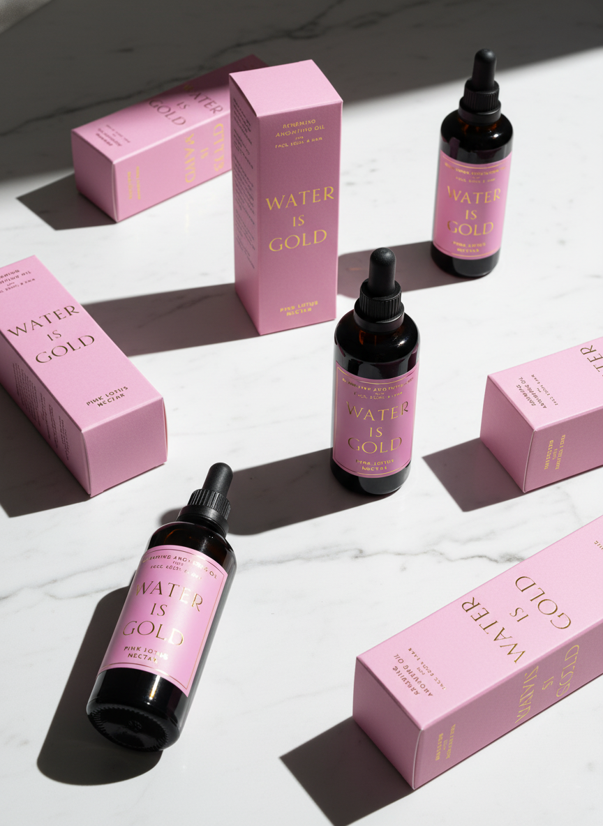
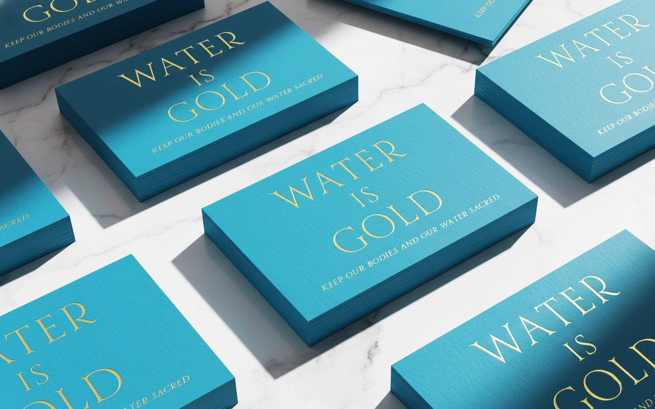
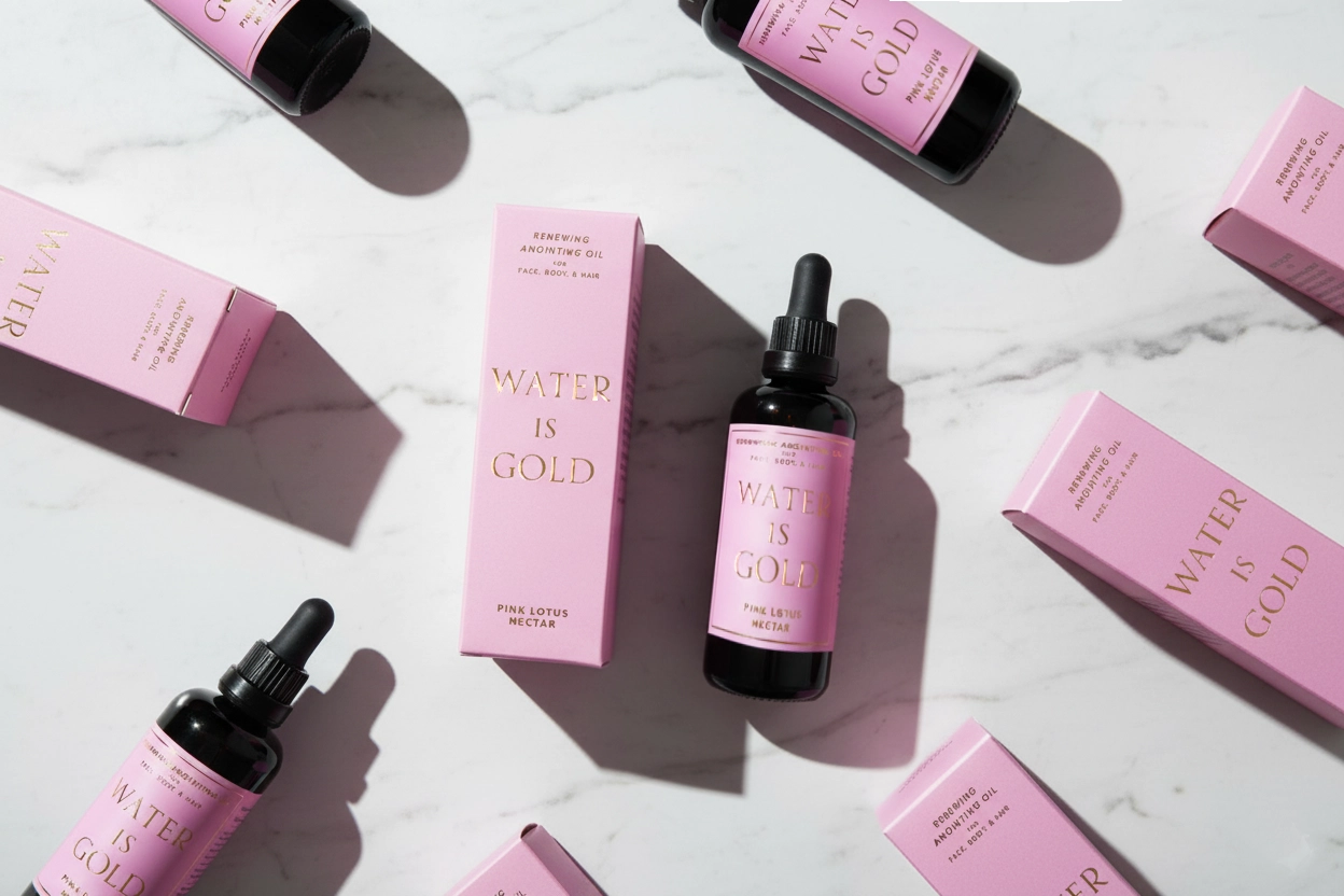
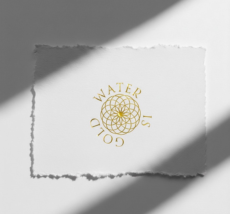
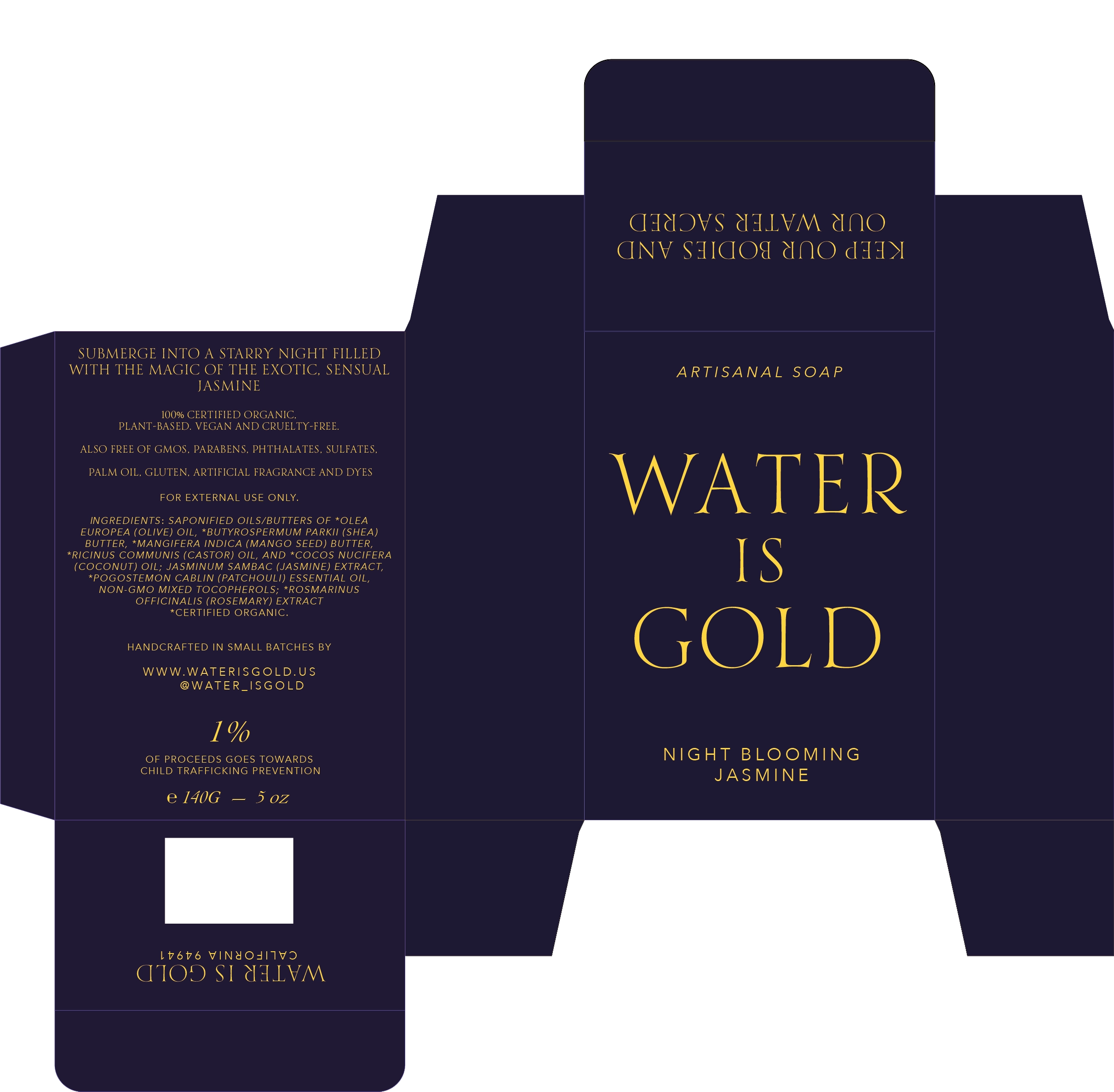
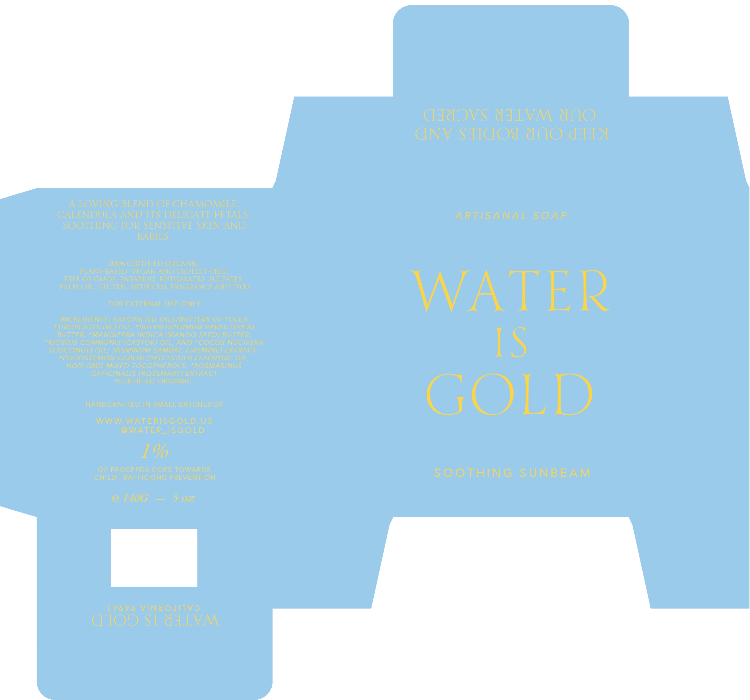
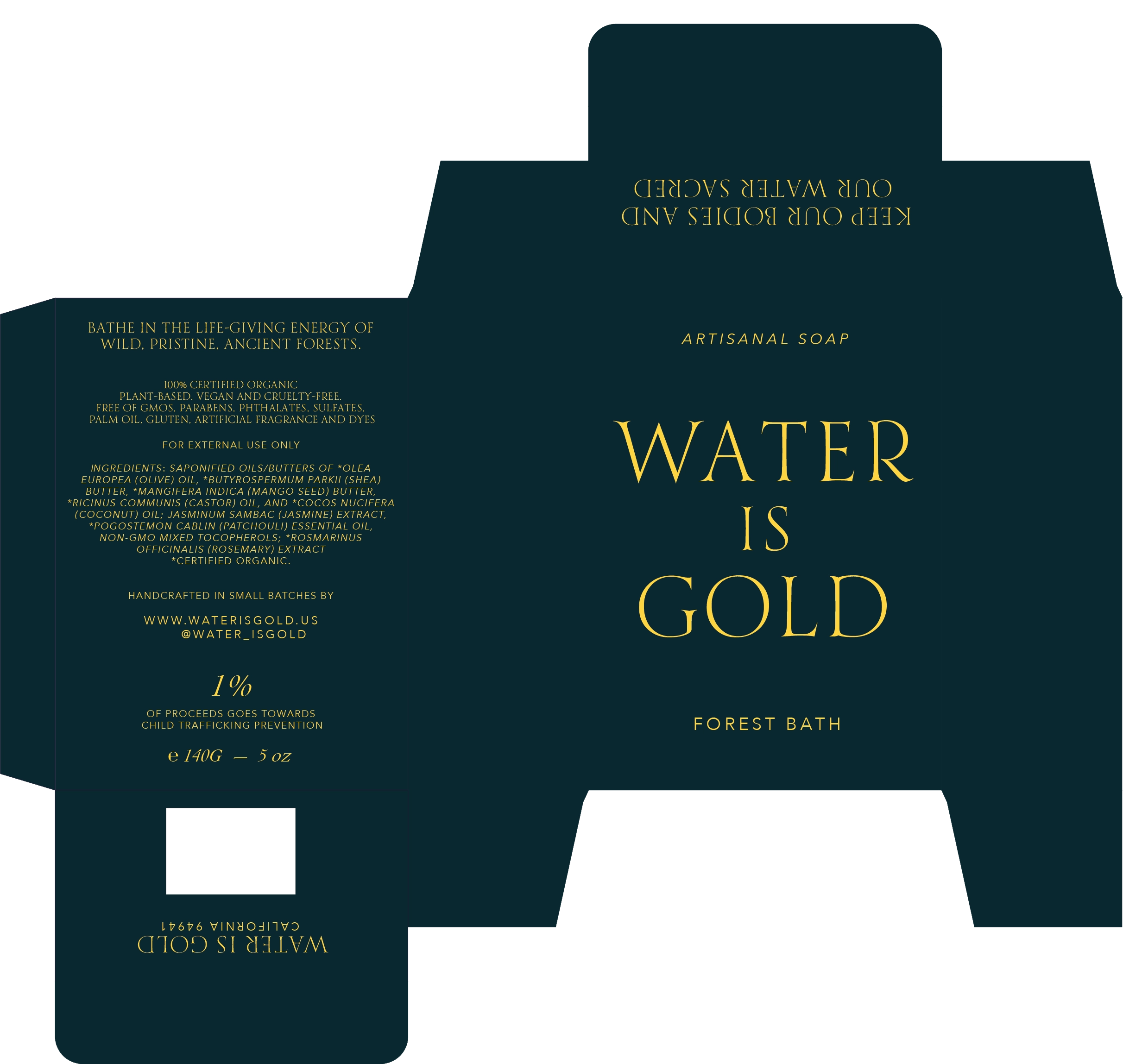
WATER IS GOLD
Luxury Artisanal Skincare Brand Identity + Creative Direction
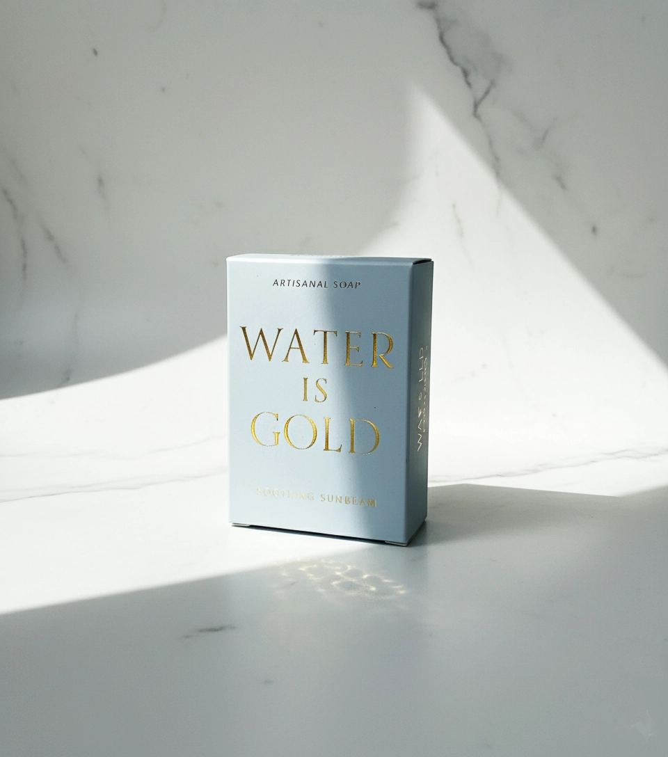
We were entrusted with the rare opportunity to shape a brand from the ground up for Water Is Gold — a luxury, small-batch skincare line rooted in the sanctity of nature’s most precious element.
This project invited us to craft an identity that would embody reverence, purity, and sensual sophistication. From concept to execution, every element of the brand — logo design, visual identity, packaging, and copywriting — was guided by the brand’s central ethos:
Keep our bodies and our waters sacred.
We explored how aroma, texture, and ritual translate into visual and verbal language. The result: a brand that feels both ancient and modern, grounded in elemental wisdom yet expressed through minimalist luxury.
As a result, the first batch of Water is Gold sold out 2 weeks after launch.
Through this collaboration, we helped crystallize a brand narrative that ELEVATES SELF-CARE into CEREMONY — where every drop becomes an offering to the waters within and around us.
OUR CREATIVE DIRECTION FOCUSED ON:
A visual identity that merges fluid organic forms with refined typography, evoking the movement of water and the purity of gold.
Packaging design that feels tactile, precious, and commanding — restrained metallic accents and high frequency colors using vegetable dyes to honor both body and planet.
Copywriting and storytelling that speak to ritual, reverence, and restoration — positioning WATER IS GOLD as a sacred experience, not just a skincare line.
IGNITING CLARITY
+ CONNECTION
With Your Core Audience
We Blend strategy, creativity, and The Verge of Technology to craft innovative digital experiences For Exceptional Brands and Thought Leaders.
PROJECT INQUIRIES
INDEX
CONNECT WITH US